Designing the control element for an indoor farming device with unexpected twists
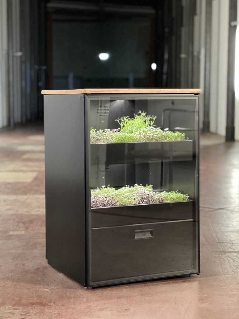
This project explores the interface evolution of the Mana Cube — a hardware-based vertical farming device by Mana Farms.
Originally conceived with a circular display, the concept shifted to a web application before ultimately being realized as a 128×128 OLED interface, discreetly installed at the bottom of the device and operated via a rotary button.
Across three technical pivots, the core challenge remained constant: designing an intuitive control system within strict hardware constraints.
THE PROBLEM
Technical constraints meet intuitive interaction
The core challenge was to develop a display interface that empowers users to seamlessly control and customize a vertical farming device — balancing usability with technical and physical constraints.
THE SOLUTION
A minimal, rotary-driven control interface
The final solution is a minimal, hardware-native OLED interface operated through a single rotary controller.
Though physically subtle and invisible from the outside, the display serves as the operational core of the Mana Cube – translating complex system logic into a structured, scroll-and-press interaction model that enables intuitive configuration and control.
MVP (Minimum Viable Product)
The initial MVP focused on designing the Operator Mode – enabling end users of the Mana Cube to independently manage essential system settings.
The goal was to provide access to all necessary day-to-day controls while keeping the interaction model simple and reliable within the technical constraints.
Advanced system configurations were intentionally excluded from the MVP.
Key Features
The Operator Mode includes:
Setting date and time
Adjusting light schedules
Monitoring and managing water levels
Configuring flood cycles
Managing cleaning intervals
Displaying and resolving system error messages
Project Directions - everyone can do "straight forward"
Designing the interface for the Mana Cube was shaped by three major directional changes, each driven by technical feasibility.
PHASE 1
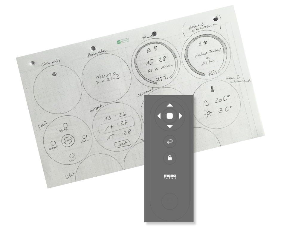
Circular Display Concept
The initial concept featured a round display integrated into the device, controlled by a remote.
I conducted early research and created first sketches exploring how navigation and information architecture could work within a radial layout.
Key challenges:
Designing hierarchy in a circular UI
Managing limited usable space
Ensuring clarity for system-critical controls
For the initial sketch phase, I drew inspiration from smartwatch interfaces and digital weather stations, analyzing common UI patterns, icon systems, and information hierarchies used in compact displays.
Alongside the interface concepts, I also explored the design of the physical remote intended to control the display.
This required defining clear interaction patterns and mapping specific actions to the input mechanism, ensuring that navigation and feedback would remain intuitive despite limited hardware controls.
PHASE 2
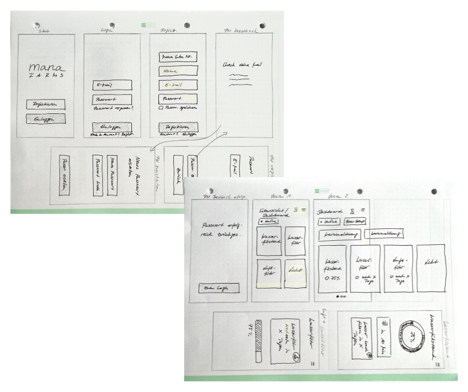
Web App Direction
Back to my comfort zone.
Due to technical limitations, the project pivoted to a web-based interface.
In this phase, I completed the full UX process:
5 W’s analysis
Personas
Jobs to Be Done
User Journeys
User Flow Diagrams
Information architecture
The challenge shifted from physical constraints to system complexity:
Structuring irrigation, lighting, and maintenance logic
Prioritizing features
Ensuring intuitive navigation across multiple states
This phase resulted in a fully structured and validated UX foundation.
When this shift came up, I actually welcomed the change.
With prior experience in designing for a web app, I felt confident continuing the process and applying established UX principles within a more familiar environment.
PHASE 3
Final OLED Hardware Interface
Never get too cozy in your comfort zone…
The project pivoted once more — back to a hardware-based solution.
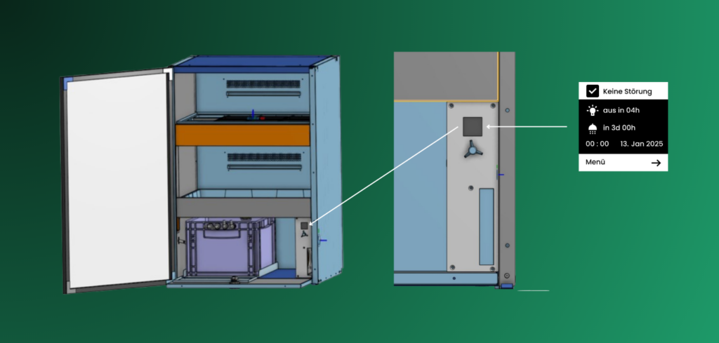
The final direction: a 128×128 monochrome OLED display, installed at the bottom of the Mana Cube and invisible from the outside. It is operated via a single rotary button.
This introduced unique constraints:
Small screen size
Monochrome UI
No touch interaction
Sequential navigation only
Limited visibility due to placement
In collaboration with a team member, I defined:
The physical placement of the rotary control
Interaction logic (rotate, press, long press)
Action hierarchy per system state
The central challenge became:
How do we translate a fully structured UX system into a minimal, embedded interface that is not even visible from the outside — yet remains intuitive and reliable?
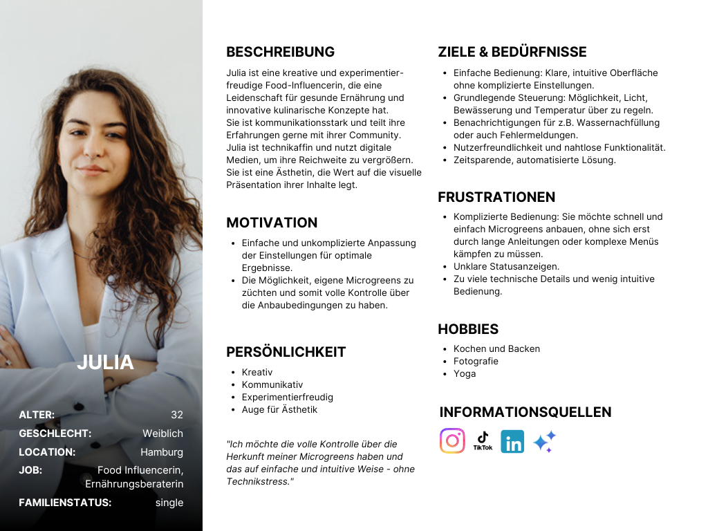
User Personas
To better understand the different usage contexts of the Mana Cube, I developed two primary personas – Julia representing private users and Michael representing commercial operators.
While both interact with the same hardware, their goals, expectations, and levels of technical involvement differ.
The private user focuses on simplicity and guided control, whereas the business user prioritizes efficiency, reliability, and system oversight.
These personas helped define feature priorities, interaction depth, and the balance between accessibility and operational control within the interface.
User Flow Diagram
To gain a comprehensive understanding of the user journey, I developed a detailed user flow diagram outlining each interaction step. The flow was iteratively refined throughout the process to reflect evolving requirements and system logic.
The final version served as the structural foundation for my initial interface sketches.
The Rotary Button
This setup illustrates the intended placement of the OLED display and the rotary button within the Mana Cube.
To ensure intuitive control despite minimal hardware input, we defined a clear interaction model for the rotary button. The goal was to translate complex system navigation into a simple and predictable physical interaction.
The final interaction logic was defined as follows:
Rotate: Navigate vertically through menus and adjust values
Single Click: Select or activate a field
Double Click: Confirm an action
Press & Hold (2 seconds): Return to the dashboard
By carefully mapping these actions, the rotary button became the central navigation tool – enabling efficient control within the constraints of a compact OLED interface.
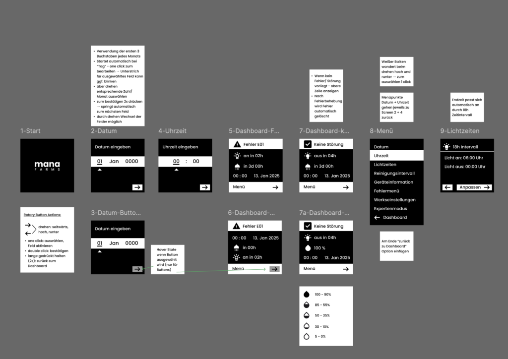
Low-Fidelity-Wireframes
Designing for a monochrome 128×128 OLED display was a distinct challenge due to limited visual resources and the lack of established reference patterns.
To address this, I focused on clarity: concise labeling, familiar iconography, and a structured layout.
Visual hierarchy had to be achieved through spacing, alignment, and grouping rather than color or typographic variation.
FIRST IDEAS & SKETCHES
At a certain point, I intentionally simplified my approach by putting myself in the user’s shoes and starting to sketch.
Guided by the user flow, I continuously asked myself:
What information is truly necessary?
Which actions are required to move from A to B?
Which icons can simplify the interface and prevent cognitive overload?
These questions shaped the early concepts and helped translate system logic into a focused, intuitive interface.
Testing and Feedback Implementation
In regular meetings with the CTO and the team, the design and it’s functionality went through a few rounds of testing and feedback implementation.
Over time, we simplified the settings and the whole user flow quite a bit, to make it as simple and intuitive as possible.
An Advanced Settings mode is planned to be included and will only be accessible in collaboration with a specialist from the team.
Access will require a service interaction and the entry of a verification code provided after consultation, ensuring system stability and preventing unintended configuration changes.
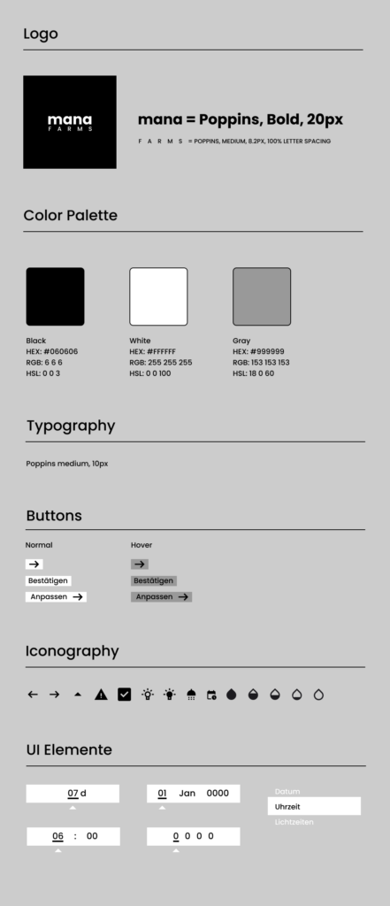
Style Guide
I translated the company’s branding guidelines into a monochrome interface system tailored to the technical constraints of the OLED display.
Within this reduced visual framework, I defined the iconography and adapted the brand language to ensure clarity, consistency, and usability.
While aligning with the Brand Marketing Owner for validation, I led the final design decisions to create a cohesive and intuitive hardware interface.
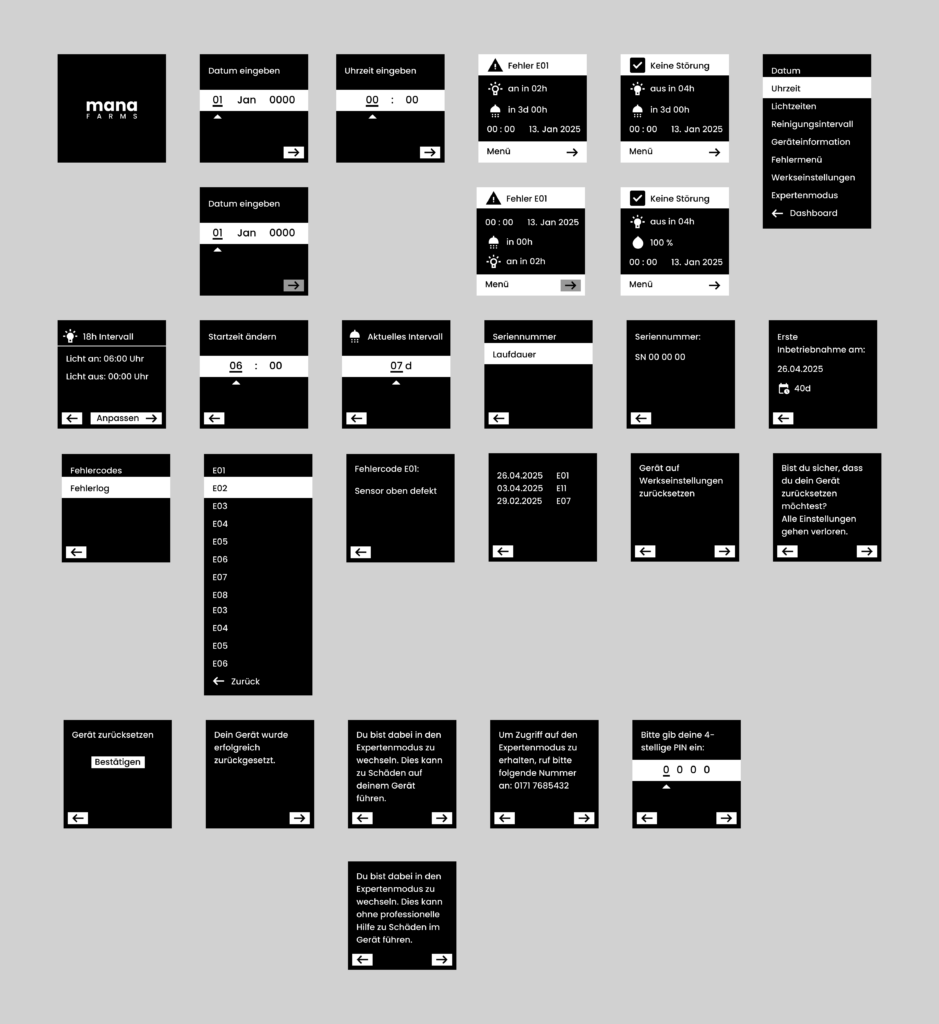
High-Fidelity-Wireframes
TESTING & FEEDBACK IMPLEMENTATION
During the high-fidelity phase, the interface was refined through multiple iteration rounds in alignment with the CTO and engineering team.
Usability, interaction logic, and technical constraints were evaluated continuously, allowing the design to mature alongside hardware and system development.
While the project was built collaboratively, I drove the UX direction to ensure a cohesive and implementable solution.
Developer Handover
The project was completed according to the defined timeline and prepared for a structured handover to development.
All final screens were delivered with detailed annotations where necessary, outlining interaction logic, rotary behavior, system states, and layout specifications to ensure accurate implementation.
The documentation clarified navigation flows, edge cases, and UI behavior to support a smooth and efficient development process.
THE FINAL PRODUCT
The final interface was successfully translatedfrom design to hardware implementation, preserving the defined interaction logic and system structure.
With the release of the Mana Cube at the end of 2025, the OLED interface became the central control layer of the product – enabling users to configure and manage their vertical farming system directly on the device.
MY LEARNINGS
“Design thrives not despite constraints, but because of them.”
1. Flexibility Over Attachment
This project reinforced the importance of staying flexible and not becoming overly attached to a specific design direction.
With multiple pivots throughout the process, adaptability became more valuable than perfection. Letting go of initial concepts allowed the solution to evolve into something more refined and technically viable.
2. Growth Happens Outside the Comfort Zone
Each directional shift pushed me beyond familiar workflows – from circular interface concepts to web UX, and finally to a constrained hardware display.
Embracing these changes accelerated my growth as a designer and strengthened my ability to navigate uncertainty with structure and clarity.
3. Constraints Elevate Design Quality
Designing for a monochrome OLED display with limited space highlighted how critical clarity becomes when options are reduced.
Typography, iconography, hierarchy, and interaction logic carry significantly more weight when visual expression is minimal. Every element must serve a clear purpose.
4. Open-Minded Thinking Drives Innovation
Working within strict technical boundaries required continuous out-of-the-box thinking.
Rather than seeing constraints as limitations, I learned to treat them as creative parameters that shape smarter, more intentional design decisions.


